In this Blog post I am going to detail how I created a vROPs dashboard based on a customer’s request.
Can we track how many VMs have been created in the past week and track if the number increases or decreases in each cluster?
If you want to just get the dashboard, see directly below, if you want to learn how it was created, keep reading further.
Installing Dashboard
- Download the files from code.vmware.com sample page.
- Import the files appended with “view” under the view’s in vROPs
- Import the file appended with “Dashboard” under the dashboard section in vROPs.
Dashboard Breakdown
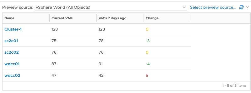
- First Item – This is a list which I’ve created to show each cluster, the total VM metric with some expressions attached, the timescale here is fixed by the list view and not affected by the dashboard timeframe. The change is an expression of the count of VMs at the start and end of the timeframe. I’ve added in some basic colouring to alert at thresholds.
- Why does it say vCPUs? When using expressions, it requires a Unit to be affixed. This doesn’t work if you’re counting something, so in our next release, this issue should be addressed. It’s purely a vanity thing.
- Second Item – This shows the VMs attached to the cluster you select on the left-hand side, showing you how old that VM is, its uptime and current power state.
- Third is a Sparkline – Showing an easy view of the changes in total VMs per cluster over a 7-day period (as defined by the dashboards time scale)
- Forth item is a trend graph, where we are showing date of the changes in the Total VM metric based on the data we have, and the trend/forecast. This trend into the future is set within the item itself. Currently we can set this to show the forecast for the next 366 days in the future.
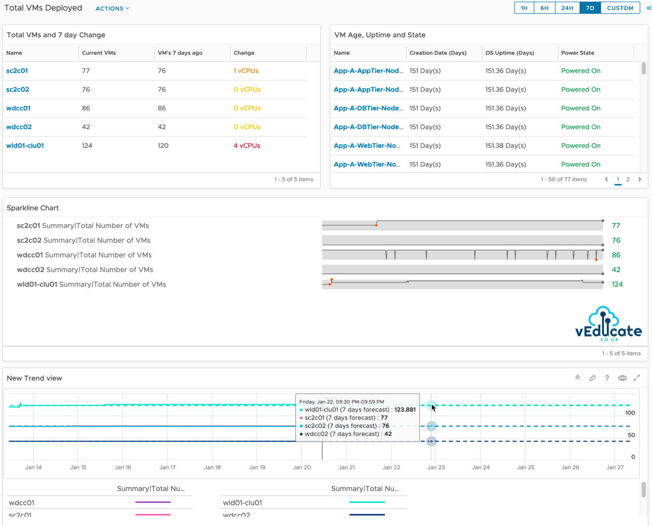
vROPs versions
To show the VM creation date, this metric is available in vROPs 8.2 and later. This dashboard/view should work with older versions of vROPs but omit the data for the missing metric.
How was the dashboard created?
First, we need to create three views.
- Show total VMs deployed in each cluster currently and the number from X days ago and the change between the two figures.
- Show VM details from selected cluster in the first view = How long ago was the VM created, what is the uptime of the VM, what is the current state of the VM.
- A trend view plotting the change in VM numbers we have seen in the clusters and using that data to forecast into the future.
View #1 – Total VMs per Cluster and change
- Create a new view and provide a name
- Set the presentation to a list
- Subjects = Select “Cluster Compute Resource”
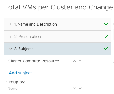
- Under Data tab, add the following metrics and configure as follows
Summary|Total Number of VMs
- Provide a metric name
- Leave transformation as current
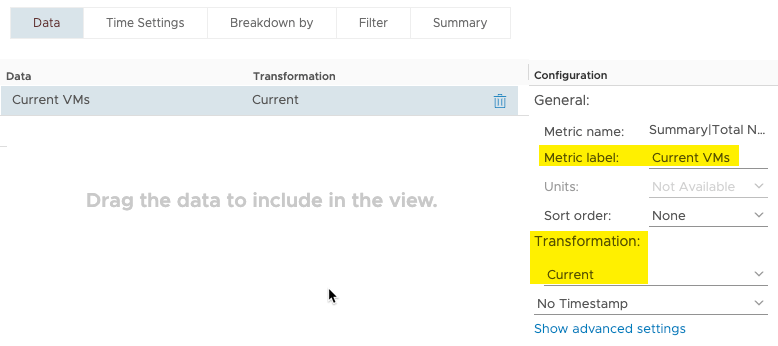
Summary|Total Number of VMs
- Provide a metric name
- Set Transformation as “First”
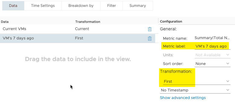
Summary|Total Number of VMs
- Provide a metric name
- Set Transformation as “Expression”
- Expression formula = current-first
- Use the advance settings to configure ranges for metric colouring as needed.
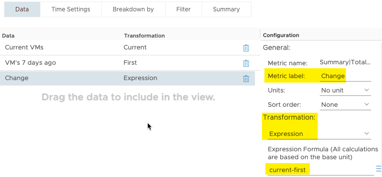
Note: In vROPs 8.2 and earlier, the Unit had to be set to some sort of figure, in my dashboard screenshot you will see the change column show X vCPUs. This issue is fixed in vROPs 8.3, as you can see in the above screenshot.
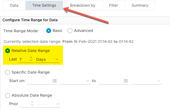
- Click on the “Time Settings” tab
- Set your time settings as needed, for me I want to track changes over a 7 day period. So, my above expression looks at the difference between today’s VM count and the VM count 7 days ago.
If we preview the data against this view, we should see something similar to below.
View #2 – VM Age, Uptime and State
- Create a new view and provide a name
- Set the presentation to a list
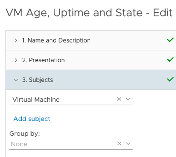
- Subjects = Select “virtual machine”
- Under Data tab, add the following metrics and configure as follows
- Provide a metric name
- Set your units
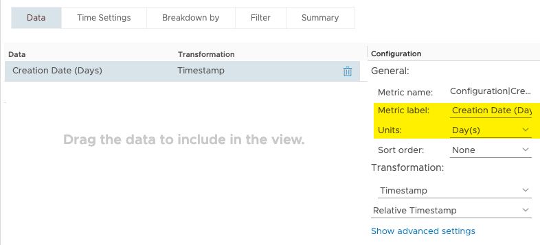
- Provide a metric name
- Set your units
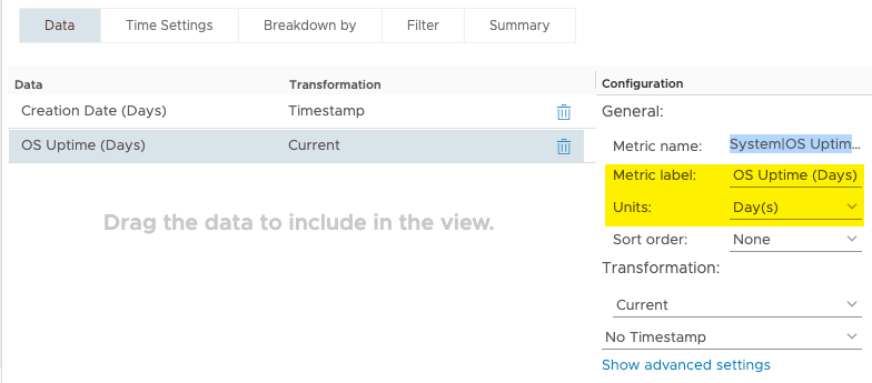
- Provide a metric name
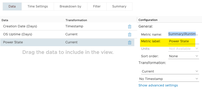
View #3 – New VM Trend
- Create a new view and provide a name
- Set the presentation to a trend
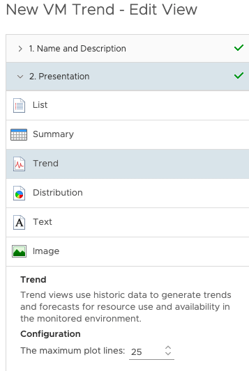
- Set the Subject to “Cluster Compute Resource”

- Under Data tab, add the following metric and configure as follows
- Set Metric name as necessary
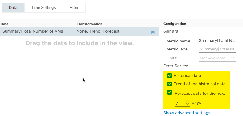
- Select all three data series
Creating the Dashboard
Next, we will create the dashboard.
This will contain:
- Our three views we created earlier (2 lists and 1 Trend)
- A Sparkline widget
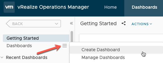
Create a new dashboard by clicking the three lines next to the dashboard navigation object on the left-hand pane and then “create dashboard”.
Next, we need to add our three views to the dashboard canvas.
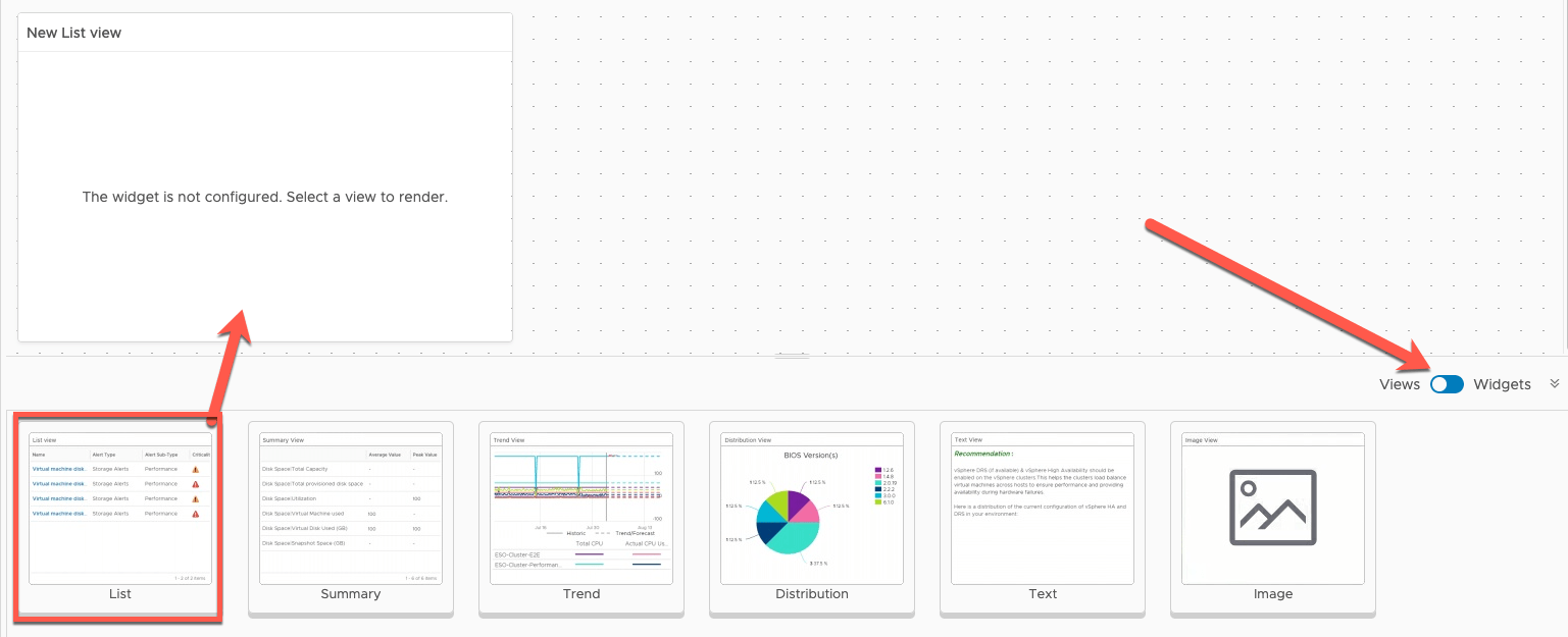
- Change the bottom selector pane from widgets to views
- drag and drop the list view object to the canvas
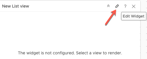
- Hover over the top of the view object in your canvas and select the pencil icon to edit
- Provide a name as to be shown on the dashboard (I just matched the view name I created earlier)
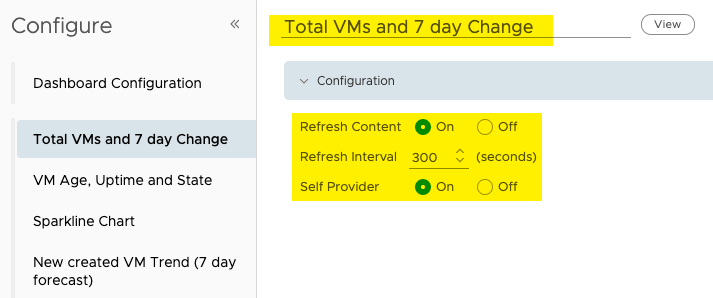
- Under Input Data – Select vSphere World
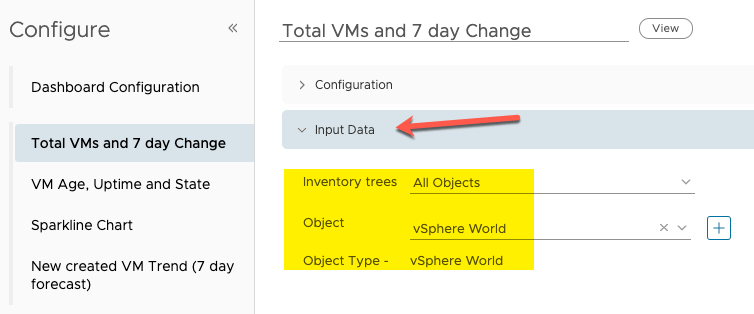
- Under Output Data – find your first view you created. here I’ve filtered the view list for my total VMs I created first.
- Select the view and click save at the bottom of the edit view dialogs.

Repeat again for the second view.
- Set as a Self-Provider
- Under Input Data leave as All Objects
- Under Output data, find your Second view.
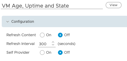


You can drag the sizes of your view boxes on the dashboard canvas by hovering over the edge of the list view box.
You should have a Canvas like the below. We will now create an interaction between the two views, so that when a cluster is selected on the list from the left-hand view, it will populate the VM data in that cluster on the right hand view.
- Click Show interactions
- Click and drag the two object points together as highlighted below.
- This will give you the blue linked line
- Click Save.
Now when we select a cluster name, the right hand VM view we creates will show us the relevant data.
Next, we are going to add our Trend view.
- Make sure you are still in the view selections and drag and drop trend view onto the canvas
- Click to edit the same as with a list view.
- Provide a name to show on the dashboard for the view dialog box
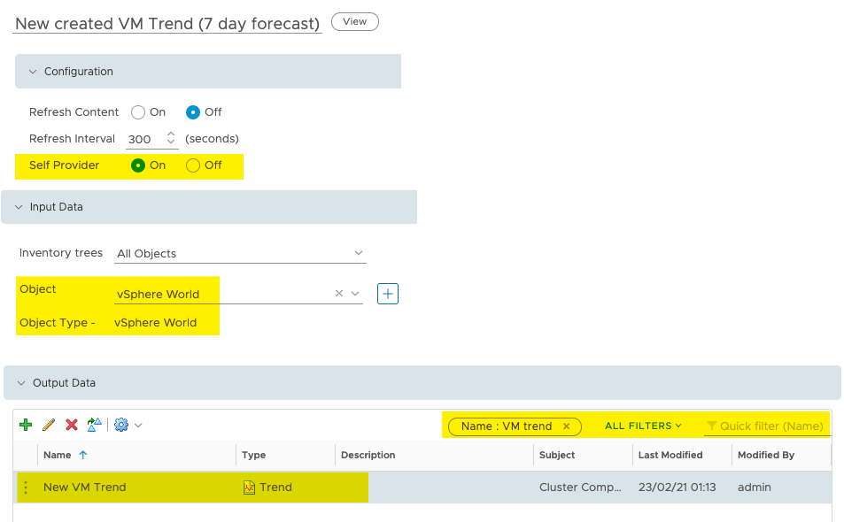
- Under Configuration – Set the Self Provider to be On
- Under Input Data – Select vSphere World
- Under Output Data – Filter and find your trend view we created earlier.
- Click Save
You will now have your Trend View Object which should show you all your clusters and the trend data of VM count as well as forecast into the future.
Finally, the last object we’ll create on the dashboard is the Sparkline. We will create this object on the fly on the Dashboard canvas.
- Change to view the widget objects list
- Find the Sparkline object and drag it to your canvas
- Resize as necessary
- However, over the Sparkline object box and click to edit (little pencil icon)
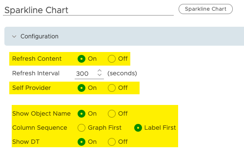
- Provide a name for the object on the dashboard
- Under Configuration
- Set to refresh content as needed
- Set to be a Self Provider
- Set to show object name – This will show the cluster names for our metrics
- Column Sequence – Label First (you can test what works for you)
- Show DT (Dynamic Threshold high and low point markers)
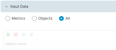
- Under Input Data – Leave this set as All
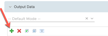
- Under Output Data – Click the green + symbol.
In the Add New Metrics Screen:
- Filter the list for “Cluster Compute Resource”
- Select the Cluster Compute Resource ObTject
- Filter the available metrics “Total Number”
- Under the Metrics collection “Summary”
- Select Total Number of VMs
Click OK. You will see your metric selected as below.
Click Save.
You will now have a configured Sparkline view on the dashboard.
And that concludes how to manually configure the dashboard and views from scratch.
Regards






Can it show what has caused the difference of machines deleted and added or doesn`t that matter? So we could in theory delete 10 machines and add 10 machines and the change is 0. Or does that not matter?
You should be able to do this, but you’d need to be more creative around monitored VM object count on the cluster as a metric, so count how many objects have been added today, how many have been removed, within vROPs itself. This metric so far is a count of current VMs and summary metrics, so as you say, in your example they would show zero.
Hope that makes sense.