I came across an interesting query on Reddit regarding vRealize Operations Manager (vROPs), summarised the query;
“Can I have a vROPs report/dashboard which shows me the storage usage by VMs over the past 3 days”
The short answer is yes, and I produced the following dashboard, views and report and uploaded to code.vmware.com for the post author to use.
My dashboard has two elements to keep things simple;
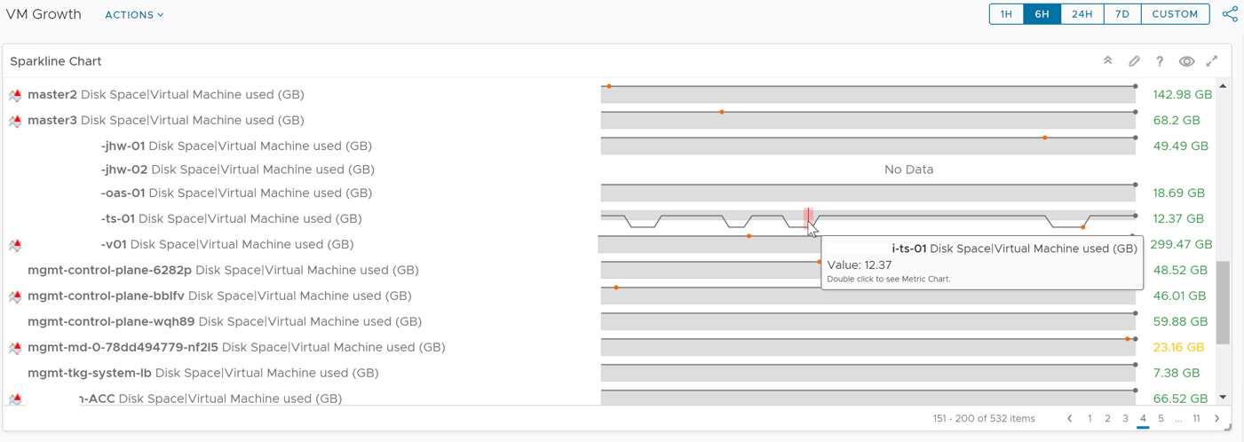
- A sparkline widget of VM’s storage used, the time frame show can be controlled in the dashboard view in the top-right hand corner
- A list view of the VMs storage used covering a few metrics
- Current Disk used
- Disk Used (3 days ago)
- Change of disk used (in GB)
- Change of disk used (in %)
So, let’s look at how I created this.
Creating a Sparkline widget in the Dashboard
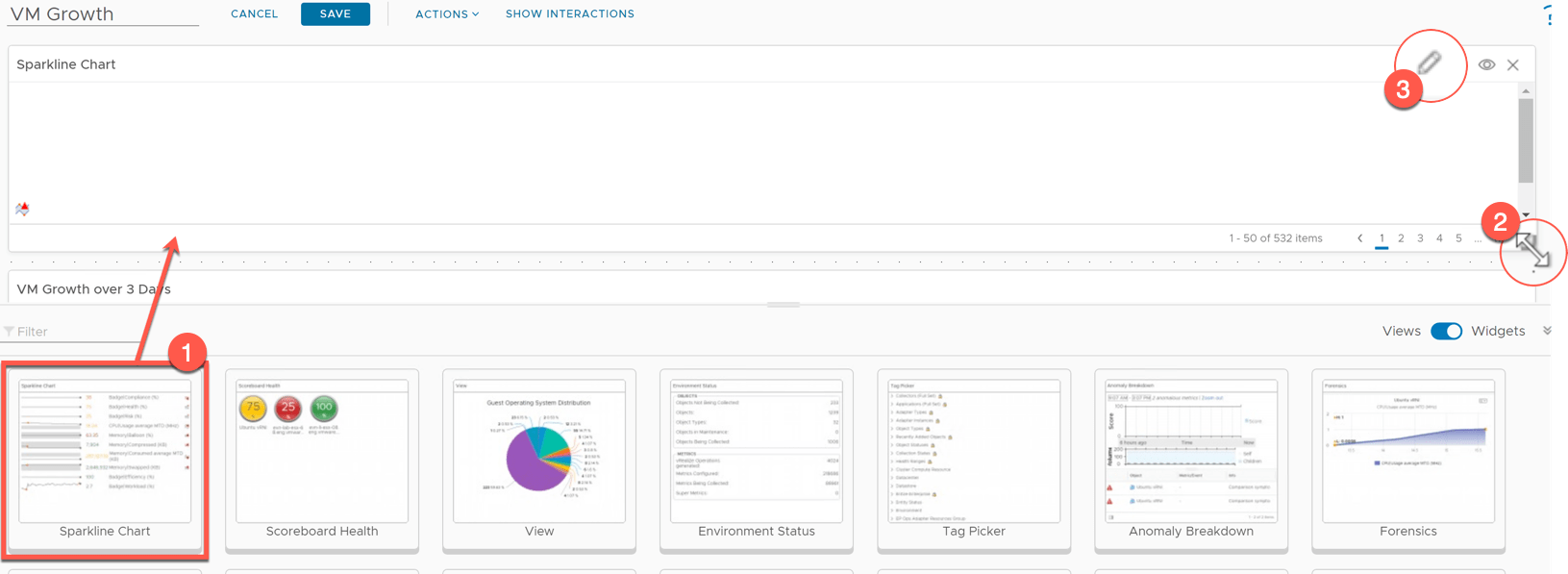
Create your dashboard, which will show you a blank canvas. Set the Dashboard name.
- Drag the Sparkline Chart widget onto the canvas and resize as needed, you’ll see this option appear by hovering over the edge of the widget.
- Click the pencil icon to edit the widget settings.
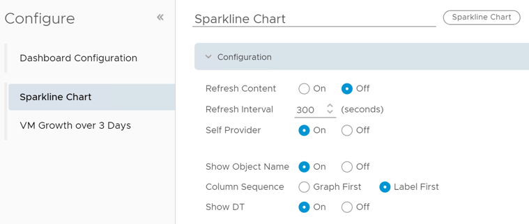
Configure the Widget configuration. The most important options here are;
- Self Provider – On
- Show Object Name – On
- Column Sequence – Label First
This means the widget will provide its own metric data to be displayed. It is not linked to other objects on the dashboard, as we are keeping this as a simple view.
The object name will be show as part of the label, with the label being shown first on the left, Sparkline on the right.
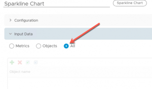
Under the Input Data Tab, select All.
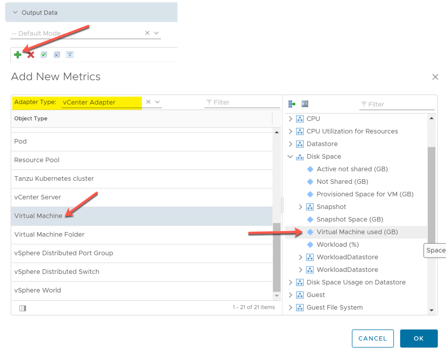
Under Output data, we will select the metric we are interest in. Click the Green + symbol.
In the Add New Metrics pane, set the adapter type to “vCenter Adapter”, and select the Object Type as “Virtual Machine”. On the right-hand side, select under “Disk Space”, the metric “Virtual Machine used (GB)”, and click OK.
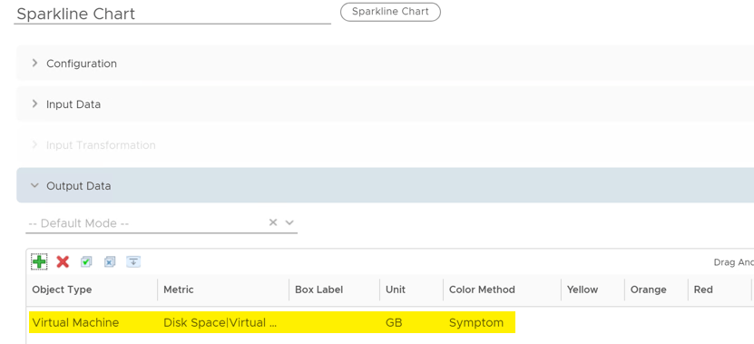
You will see the metric added to the output data.
Under Output Filter, I have left this unconfigured in the dashboard you can download from the code.vmware.com website I listed at the start of the blog post. However, as an example, below is showing where I am filtering to show only VMs where disk space used is over 100GB.
For setting the time frame of this widget, you have two options.
- You can let the widget follow the overall time frame of the dashboard.
- You can configure the time frame used by widget regardless of the rest of the dashboard
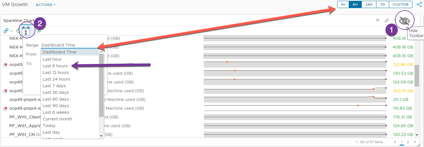
To see the time setting used for the widget, you can hover of the top right-hand side of the widget pane, this will show you widget control options.
Click the Eye symbol. Then click the Calendar symbol. The first option is dashboard time, which will follow the master time setting, as highlighted by the red arrow.
Alternatively, you can statically set the time range from the options provided, or provide a custom range (purple arrow).
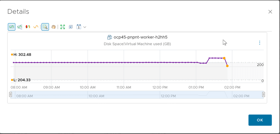
Final point to make on this widget. If you are interested in a particular virtual machine, you can double click on the Sparkline and this will show you more data for that particular object’s metric.
Creating a view which shows the change over a time frame
- Create a new view, and provide a name
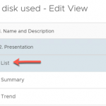
- Select “list” for presentation
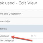
- Under Subjects, select under vCenter Adapter > Virtual Machine
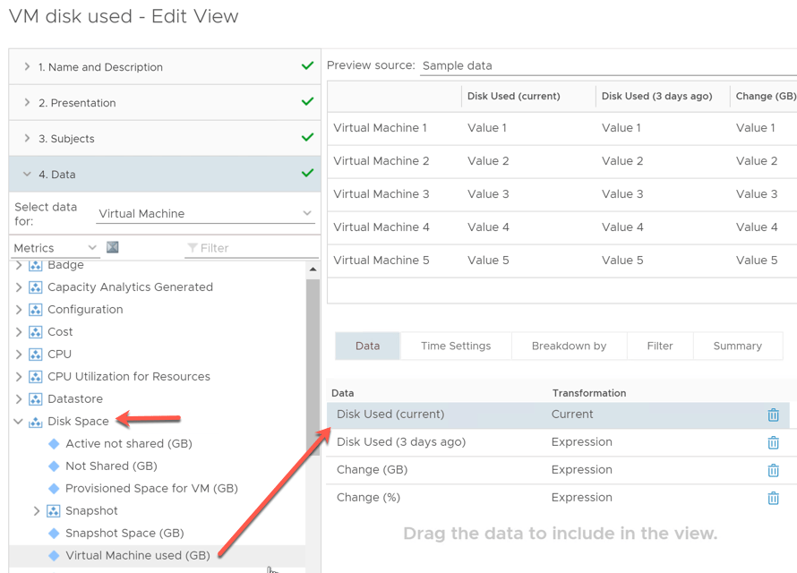
- Under Data, select Metrics > Disk Space > Virtual Machine Used (GB)
- Drag over to the “data used in view” space
I copied this metric across four times to create the columns needed, I will alter the configuration of each metric to display the data I need.
- Disk Used (Current)
This metric stays the same, showing the current disk usage of the VM. I just altered the metric label.
- Disk Used (3 days ago)
This metric is the same as the above, however I edit the configuration under transformation selecting the “expression option”. For the expression formula I simply choose first.
This configuration will show the metric that has first been recorded in this view. How do we ensure this shows the data from 3 days ago? Or 7 or 14 or 21, or whatever you want? We use Time Settings Tab to control this, which is discussed further on.
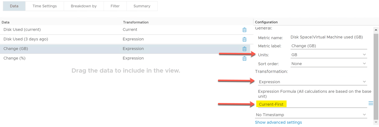
- Change (GB)
This metric gives us the change between todays value and the value as of 3 days ago (or whatever time frame you set)
Again, we are doing something similar as above by using the expression formula feature. The math is simple = Current (metric recorded) minus First (metric recorded).
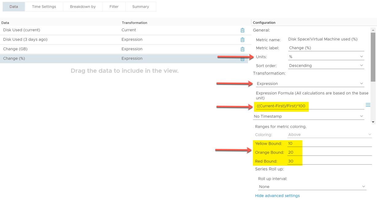
- Change (%)
This last metric will use a slightly more advanced settings and calculations to give us the percentage of change.
I set the sort order to Descending, to show the largest value’s first. This will mean my view will show the VMs with the largest data growth over X days first.
Once again, I use a transformation expression to work out the percentage. Current value minus the First recorded value. Divide the output by the first value and multiple by 100 to give me the change in a percentage.
I then also set some metric colouring. So, if the percentage change is 30% or higher, it will show as red.
- Time Setting
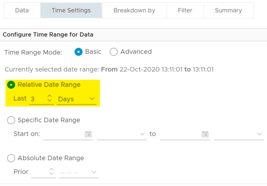
So, the most important bit about this view is the time setting. So that these expressions show you the data growth over X days. It’s simple to do.
Click the Time Settings Tab. Select “Relative Date Range” and the number of days you are interested in.
- Save your view
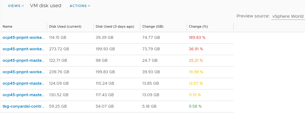
Finally, you should end up with something that looks like this when pointed at your vSphere World (or other filter source as needed).
Summary
The main subject of this post is covering how to use the Transform with Expressions feature against a metric in a view within vROPs, marrying this to the time setting for that view.
Again, you can download all the files discussed to use in your vROPs environment here;
Regards





This is very helpful glad I came across it. A few questions
1) It looks like the time setting in the view is limited to one selection, but what about if I wanted multiple times, think, current, 3 days, 7 days ,14 days,etc.. Any way to adjust for that?
2) How can I make the dashboard cluster specific? I have 40 clusters and 1500 vms, I only want to look at one cluster and the 50 vms within it
3) when I attempt to import the report, I get “View with the same ID as ‘VM disk used’ already exists” Do I need to delete the View and only import the report?
Sorry for all the questions,
-Glenn
Hi Glenn, sorry it took a while to reply.
1. For this dashboard creation, you can clone the views, change the timeframes on them under time settings in the view. Then add to the dashboard. Alternatively you can set the view to take the time from the dashboard time setting (top right on the dashboard).
2. If you want to make this cluster specific, you can add in an output filter to select the cluster you are interested in. Alternatively you can add an object picker to the dashboard, and link this to the view, so that the view chooses its inputs from there.
3. Have you imported the view once before already? I’m sure there is no out of the box view with this name, but you could open up the view file and change the name in there before you import if needed. You’d then need to select the view again in the dashboard, as the name would be altered.
Regards
Dean
Hi Dean,
This is fantastic and will help us a great deal. One question is the Sparkline Chart isn’t populating, it’s telling us widget configuration is not completed yet for about 3 hours now. Is this normal? We’re on 8.6.2 of vrops
This shouldn’t be taking so long, can you try cloning the dashboard to see if the same happens? If so, it might be worth a opening a support ticket with VMware.
Hi, I tried creating an object list widget with datastores and then linking an interaction to the spark widget, but they don’t seem to connect properly. Selecting a datastore and then seeing only the growth of VMs on that datastor would be ideal for troubleshooting why a datastore has run out of space.
Yeah I’m not sure how you make that relationship between the two work, potentially you’d need to have an Object picker (datastores) interact with a second object picker (lists of VMs on that datastore), then you can show a spark line for any selected VM from that second object picker list.
It’s worth asking in the VMware community forums if there is another way to achieve this.
Dean, cool graph is there anyway to export the data to a csv from the sparkline widget?
I don’t think so
Where can this be downloaded from nowadays? the link redirects to Broadcom and I was unable to locate it even with an active account. Thanks in advance.
Good thing I showed the steps to recreate this, I’ve no idea under the new BC sites how you navigate to find the content, however this is the new landing page for the sample exchange, there seems to be no search box though. https://community.broadcom.com/developer-portal/communities/community-home/librarydocuments?communitykey=d743a854-b7b6-437f-9698-4dd8983b11cf
I did use the old sample exchanges github to store this in, which is handy, so the files are here! https://github.com/vmwarecode/Basic-VM-Growth—Sparkline-Dashboard—List-View—Report